There have been so many talks on constraint-based layouts or container/element queries lately and that’s because without them responsive styling with media queries will remain an unpleasant hack.
What does any of all that mean? Constraints based layouts puts child layouts or components to the scope of their parents such that changes made are relative to the parent/container size.
What may come to your thought at first is just use a percentage value to achieve a size constrained to parent. By doing that we’d be making a fluid design and we had that before responsive design with media queries yet we needed more responsiveness beyond fluidity.
Media queries allow you make certain styles based on the size of the viewport (min-width: 720px) means target viewports that are 720 or wider. Consider having that constraint to be in the scope of an element instead.
What is an element scope? Like scopes in JavaScript, scoped styles were implemented to limit a set of rules to an element and its children without the need for a class or any selector. But after a while they were removed from chrome and most of the other browser vendors never attempted to implement them. With its syntax,
<section>
  <style scoped>
    h1,p{ color: tomato }
  </style>
  <h1>Time to play a game</h1>
  <p>I left my game pads at the zoo.</p>
</section>
every scoped style only applies to elements within the container element that has the style but this wasn’t really solving any problem that can’t already be handled with existing selectors. Container queries are to behave somewhat like this but with a combination of the media query behavior.
Up until now I’ve used container queries and element queries like they mean the exact same thing. To clarify I’ll try to explain them better. If given a syntax like in the figure above:
section{
  @container (min-width: 100px){
    h1{
      color: tomato;
    }
  }
}
our constraint will always have to contain the depending elements (i.e a parent element) which would leave us with half the solution of what we need constraint based layout. There is so much that can be done with this which we will get into later but as of now this just shows that a container query isn’t the solution to constraint based layouts for the web, elements queries are.
Another syntax that have been proposed by the RICG for container queries is as below:
section:media(min-width: 100px) h1{
  color: tomato;
}
We could Sass that up with some nesting:
section:media(min-width: 100px){
  h1{
    color: tomato;
  }
}
as it shows, container queries would only ever be able to affect their descendants. Element queries on the other hand should affect just about anything. If we weren’t targeting descendants only, that same syntax could look this way:
section:media(min-width: 100px){
  body{ background: lime; }
}
This means if I have a section greater than or equal to 100px make the body background lime. body doesn’t have to be a child or descendant to section to be affected by its scope. It goes beyond container scoping as a great way to address element queries however the syntax could be very misleading. Anyone with normal experience in CSS would expect section to have a body descendant. How do we solve the syntax problem and achieve this right?
Solutions to constraint based layouts
Cassowary constraint satisfaction algorithm, a known layout solution used in Apple development was used as an early implementation of CCSS (Constrained Cascading Style Sheet) after which more solutions like GSS (Grid Style Sheets) have tried to adapt the concept behind it.
More recently, EQCSS (Element Queries CSS) was born as a great speculative polyfill for element queries by Tom Hodgins and Maxime Euzière. It puts the at-rule into consideration for scoping elements like it is used with media queries and proposes the best syntax yet.
@element section{
  body{
    background: lime;
  }
}
Like media queries before being used for RWD (Responsive Web Design), we could target any media without specifying any dimensions
@media screen{
  body{
    background: lime;
  }
}
the eqcss snippet would change the background color provided there is one or more section element in the CSSOM. Then with media queries we get responsive design with conditions:
@media screen and (min-width: 720px){
  body{
    background: lime;
  }
}
which element queries offer as:
@element .mod and (min-width: 100px){
  body{
    background: lime;
  }
}
an element could be its own constraint which would help achieve better pluggable atomic design.
What happens when there is more than one element being used as constraint? Eqcss allows you to target current scope only with meta selectors
@element input and (min-width: 100px){
  $this:focus{
    border: solid thin crimson;
  }
}
This would only apply a border to the input that is focused and no other input. There are more meta selectors including with demos here. They include $parent, $next, $prev, and $root.
EQCSS allows more conditions for the scoped element including min-aspect-ratio, orientation, min-scroll-y, min-lines, min-characters, min-children, and more.
Container queries and cyclic dependency problem
People have raised possible issues with container queries to be circularity of dependent containers or recursion. Basing an element on the container of a container of a container may lead to a O(N2) complexity. Here’s what the recursion looks like from an example by Martin Auswöger
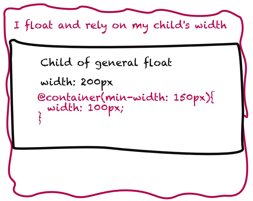
.container{ float: left; }
.child{ width: 200px; }
.container:media(min-width: 150px){
  .child{
    width: 100px;
  }
}
Ausi recommended that the fix to this would be to use a syntax like this:
.child:container(min-width: 150px){ width: 100px }leaving the browser to make a decision of a reliable container after traversing the DOM to find ancestors. The container would then be the nearest ancestor with a fixed width or the document width when no ancestors are found.
How does EQCSS handle this? As said earlier, EQCSS does not use container queries but element queries hence there’s no such thing as scoping child elements within their parents. It simply picks an element and gives it a condition to be met. What this means is, when the problem above is addressed with eqcss, the child element would just always base on its on min-width since the scoped element relies on it. It does cause a few self-referencing issue but CSS already has self referencing issues. This video explains:
Here’s eqcss addressing the problem above. As of the time of testing it only behaves weird in Chrome Canary (Chrome 60) and that’s not surprising as we see with the growth of Chrome things get weird like it did with will-change.
and a demonstation of it when resized: